|
Of the three artists I’ve studied this year, Marion Bolognesi was my favorite. Her work appeals to me because it’s influenced by abstraction, is colorful, and is realistic all at the same time. These three elements are my favorite combination that I’ve found so far. Also, I’ve always had a fascination with eyes, the main thing that Bolognesi paints on her own.
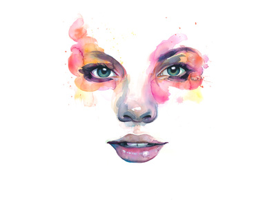
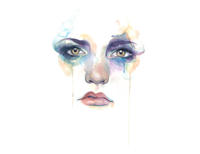
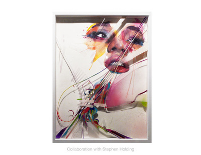
Marion Bolognesi’s main job is to design handbags. Her designs are simple but interesting. For a while before this, Bolognesi was an illustrator for children’s books. I’ve personally had an interest in the concept of both of these jobs before. I think I would enjoy designing clothing more than handbags, but both would be fun. As for illustrating children’s books, I’ve thought that decoration was really cool since I was very little. So much so that at the daycare I went to, when we were writing and illustrating books of our own, I went all out. My book was mainly cardboard, tissue paper, a lot of paint, and cardstock. My elaborate story was accompanied by the most vividly colored pictures I could manage. I really enjoyed adorning this little book and would like to do it again sometime. It’s fun in art to dive deep into your mind and be imaginative with your drawings/paintings. Emotion has been troubling me more and more as I get older because I quite simply don’t understand it in myself. On the contrary, I read others’ emotions and empathize with ease. I’ve always been fascinated with them and the way that Bolognesi is able to capture so much of an emotion with simply watercolor paintings of eyes amazes me. Her work varies, however, and some of her pieces do have some other facial features but never the entire head. Every brush stroke adds to the overall feel of the work. From the curves and edges to the vivid or soft colors, every detail creates another layer of emotion. While trying to recreate her works, I found it very difficult convey quite the amount of emotion that she is able to. I love all of her pieces so it’s quite difficult for me to choose just a few to call my favorites. Of her watercolor paintings, Figure 1-2 are my favorites. Figure 1 is so upbeat and happy which makes me happy. I also really like the color scheme. Figure 2 caught my interest because it conveys an emotion that I’ve experienced that words cannot easily describe. That’s another thing I really like about her work, it says what words can’t about emotions. We all know what emotion it is conveying, but don’t have the words to describe it. Figure 3 is my favorite out of her collaborations. She came together with Stephen Holding and created something spectacular. Design and color seem to be more of a theme than emotion in this piece and I actually really like that because the way that it’s put together has a nice flow. I really like that it’s a shadow box because of the dimension and effect it gives the piece. Holding’s work highlights the colorful abstract influence in Bolognesi’s work perfectly. I love what they ended up with and hope that they’ll collaborate more often. These images and more can be found on Marion Bolognesi’s artist site, http://www.marion-b.com/ .
0 Comments
What does public education teach kids? Seems like a stupid question; we give them an education in the core subjects of English, Mathematics, Science, and History. While this is a good start, it’s not where we should stop. Many people take an arts class just for the “easy ‘A’” instead of because they enjoy the arts. Why does this happen? Doesn’t this seem wrong?
I’ve taken art, excluding ninth grade, since sixth grade. I’ve taken band, a musical art, since seventh. In middle school arts classes, people tend to take the class because they are curious. They sign up for classes that would give them a break from more dull classes, a chance to be creative and have fun. However, many times I’ve been in a class where there’s a select group of kids who don’t take it seriously. They’re only there for the grade. This is because counselors, teachers, and even parents drill their children to think that their only hope for a future, the only way to get a good job, is to get good grades, go to college, and get a degree. Preferably in law or medicine, because that’s where the money is. I’ve even heard my own parents say to me that I need to focus on my core subjects more than any of the arts. Why? Just because it’s more difficult to make it in the arts doesn’t mean someone shouldn’t do what they love. The reality of the world of jobs in the twenty-first century is that a degree, an education, good grades, they’re good to have but don’t guarantee a job anymore. That way of thinking was designed for the age of industrialism. These and many other ideas are discussed in Sir Ken Robinson’s presentation at the TED conference, “Do Schools Kill Creativity.” Sir Ken Robinson tells of a little girl, who would grow up to be a very successful dancer, could not sit still in class. She was taken to the doctor and the doctor realized that it wasn’t that she was ill, but rather that she was born a dancer. In recent years many doctors wouldn’t think of this, but instead give her a bottle of pills and a diagnosis of ADHD. If you’ve ever watched a little kid play or draw, you know that we all start off with a wild imagination an overflow of creativity. As we grow, instead of being nurtured, this is crushed out of us. Any arts class that encourages the creative, imaginative side of us is the key to harnessing this creativity for keeps. In my personal experience, I always feel relaxed, renewed, and full of new ideas after leaving an arts class. I’ve even had other people comment on this or say this themselves. Arts classes have greatly impacted how I think, speak, go about things in my live, and how I act. I’ve noticed that as I take more classes, the imaginative side of me really opens up and I have better, more obscure ideas. This is crucial for me currently because it helps me in many subjects, including math, by allowing me to see things in a different way. I’ve gotten much better at coming up with new ideas to solve problems. Sir Ken Robinson defines creativity as “the process of having original ideas that have value.” By this definition, creativity has not only been a part of my life so far, but will need to be a part of my life in the future. In the work place, creativity and the ability to see many solutions to a problem is a wonderful skill to have. Companies need employees that can come up with new ideas and solutions to improve their business. So, while a diploma and good grades alone won’t guarantee you a job, your way of thinking and ability to be creative can really help. Not only are arts classes important as a way to encourage creativity, they also offer an outlet for the artist. Many musicians will tell you that their inspiration to pursue music is that it was their way of coping with whatever may have been going on in their life. The same applies with many masters of the visual arts such as Jackson Pollock and Vincent van Gogh. For me, the arts allow my mind to run freely, without the weight of the real world. I find peace in being able to embrace something I enjoy. I often find myself overwhelmed with what’s happening in my life and the arts offer a form of release. Art and music therapy prove that these are effective ways to cope and make the person struggling feel better. Even if you’re not struggling, the arts are still an enjoyable addition to any day. We live in a high stress world, and schooling in particular puts way more stress on kids than it should. The least we can do is give them a way to relieve themselves of this pressure. Terrified of being “wrong” many people decide not to speak their ideas or go “outside the box.” We don’t start out like this, but rather it is drilled into children as they go through the education system. Don’t be wrong, but think outside the box. Conflicting right? How can someone think outside the box if we’re creating the box by saying what’s right. In my experience, there is no “wrong” in art classes. If you want to do it, you can, and if you say it’s right, it’s right! In our current education system, kids are put down and think that they’re no good because we constantly tell them they’re wrong. We don’t applaud the good things they can do as much as we should. My current art teacher, Mike Guyer, once told the class a story of a boy who wasn’t very good at his core classes, but adored art and was amazing at it. In a meeting with the boy, his teachers, and his parents, it was decided that he would be allowed to focus mainly on what he loved and was good at, art. I think we should be able to encourage a student’s ability in any subject they like and want to pursue. My own parents will get mad at me for spending too much time on subjects that I like better, but I think we should encourage that, to an extent of course. Sir Ken Robinson tells us that “our only hope for the future is to adopt a new conception for human ecology; one in which we start to constitute our conception of the richness of human capacity. Our education system has mined our minds in the way that we strip-mine the Earth- for a particular commodity, and for the future it won’t service. We have to rethink the fundamental principles on which we’re educating our children.” I completely agree with him. In order to help children prepare for their future, one where there’s no guarantee for a job with just good grades and a diploma, we need to start nurturing the seeds of creativity and imagination that they are born with. We can begin to do this simply with encouraging the arts in education. organic rhythm is as intricate as it is whimsical. I’ve looked at each piece of art individually on many occasions and each time I notice another detail or concept that makes the works shine.
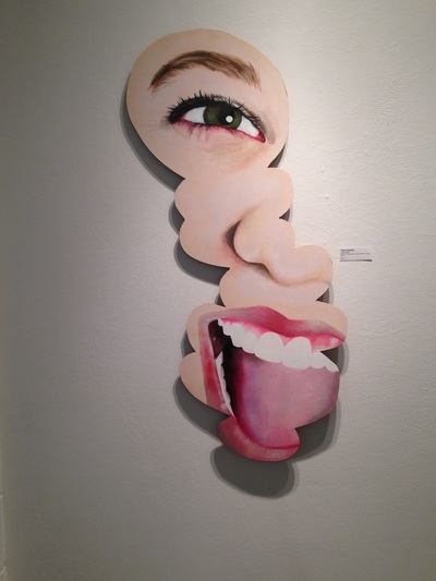
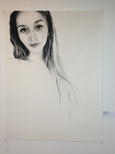
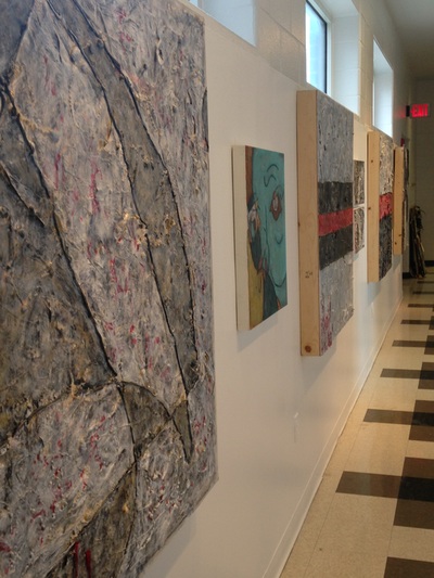
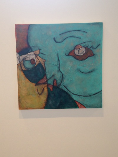
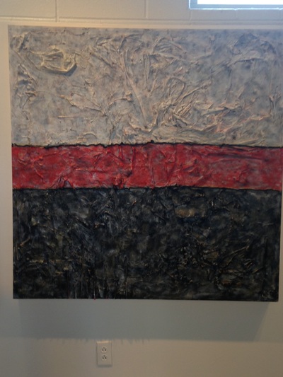
Placement wise, I did not understand the thinking behind Taylor Zabinsky’s layout. I tend to organize things by their correlation to their surrounding pieces. Instead of doing this, Taylor’s ordering was more random, or so it seemed to me. However, the seemingly random organization made me more curious about the pieces because I never knew what would come next. In the entry way, she has two works: a large one of a jubilant girl painted on a bubbly organic shape, and a glass panel with a detailed skull missing the upper half to display the colorful brain painted on. I have to hand it to her, I love her use of color and the bubbly shapes that influence just about every one of her works displayed in the show. These were my favorite in terms of how they were presented. Pushed away from the wall with lights right above, they had a very neat shadow that separated them from the wall. While I like the images on paper, I didn’t like how they were displayed. The off-white paper appeared stale and somewhat dirty against the crisp white wall. They didn’t stand out to me. Even simply putting mat board around the edges would’ve helped the transition. My overall favorites of hers included one of these, despite how they were presented. The piece I am referring to is called “Serenity” and consists of charcoal on rag paper. The drawing itself is a beautiful representation of a girl who wears the expression of “calm, cool and collected” in addition to appearing friendly and welcoming. I think that Taylor did a fantastic job with blending and shading in the face and neck of the portrait. The portrait really draws your attention to the beautifully-drawn eyes and the slight smile that dances on her lips. There is a lot of negative space in the drawing to aid this focus. The hair is very dark to contrast the light features, and as it flows down the page, it fades off into nothing. I wish that this piece in particular had been placed alone or in contrast with colorful pieces because it leaves the viewer with something left to be desired. The works on either side of it have a lot more going on in them which makes it difficult to appreciate this work for all that it really is. My other favorite has to be the bubbly-shaped, mixed media on panel that is seen upon entering the hall. The detail in this piece is phenomenal as well, and obvious from far away or close up. What blows me away the most about this piece is despite not having the entire face to use as reference to spacing, the proportions are near perfect. The bright colors, glistening smile, and unusual shape all give it an aura of happiness and joy. It is called “Animated”. On the left side of the hall, Caroline Cox’s work greatly contrasts Taylor’s. Never-before-seen combinations of the most obscure materials, Caroline’s pieces are a lot to take in. I had to giggle a bit to myself at a particular work because it had a doctor’s mask in it! I never would’ve thought of that and that’s why I think Caroline’s work is so cool. In her artist statement she talks about how, “spontaneity is essential to her process,” and that it, “is open to change at any moment.” Another unusual material I found in a few pieces was straws. I’d love to talk to Caroline and find out just how much is in each piece and what gave her the ideas. One thing in particular that I would’ve liked to see more of to make the works more interesting would be color. Off white and black were the main colors I saw in these works so they didn’t stand out very much in contrast with Taylor’s style. A few pieces had some red in them which was a nice addition. My personal preference in terms of color is vivid, fun colors, and a lot of them, so Caroline’s work didn’t grab my attention as much as it otherwise would have. With a composition like this, there’s a lot for the viewer to look at which gives her work a lot of potential. Hung in a pattern of large, small, large, small, the organization was clean cut and professional. I feel as though Caroline’s style and overall approach would appeal to a different audience than Taylor’s. Taylor’s is more cheery, bubbly, and wonderfully childlike while Caroline’s is more classy and thought-provoking. I think that both of the girls did a great job with their individual work, but when paired up it just didn’t flow well. However, I did like that it gave two different approaches so there was something for both types of people. In the entryway of the hall, there was a brilliant piece that combined their styles and worked on it together. Caroline’s style didn’t shine through as much as Taylor’s but the final product was quite interesting. A set of Taylor’s organic shapes influenced by her use of color along with Caroline’s creative materials made this piece stand out. Glue and ink made a colorful explosion on panel! All in all, I enjoyed the show a lot and thought they did a nice job with it. |
Emily HeronDRHS Art IV, III, & II Archives |
